I honesty can't believe it is this time of year again. I know we all say it but it is so true, every year just seems to go faster and faster! I LOVE giving and receiving holiday photo cards. Each day the mail comes during the holiday season I feel butterflies in my tummy because I know I am going to get to see my friends and family's holiday card creations. I display them proudly and it is always hard for me to take them down. I just love seeing all those beautiful families up on my wall.
In the past I have designed and sold holiday cards, however I don't anymore. The reason is simple. There are so many AMAZING consumer design platforms out there that take away the middle man and allow my families to design their cards exactly how they want in a matter of minutes. I provide the images and they create their cards. It really is lovely.
That being said, I wanted to share a few tips on how to make an impactful and artistic holiday card that will have your families and friends smiling from ear to ear all season long.
1. First, I want to share with you my favorite consumer card sites. I love ARTIFACT UPRISING and MINTED . What I love about both of these sites is that their cards are modern, clean, and elegant. They use high end materials and are simply luxurious to the touch. I urge you to have a look around both sites. I know you won't be disappointed.
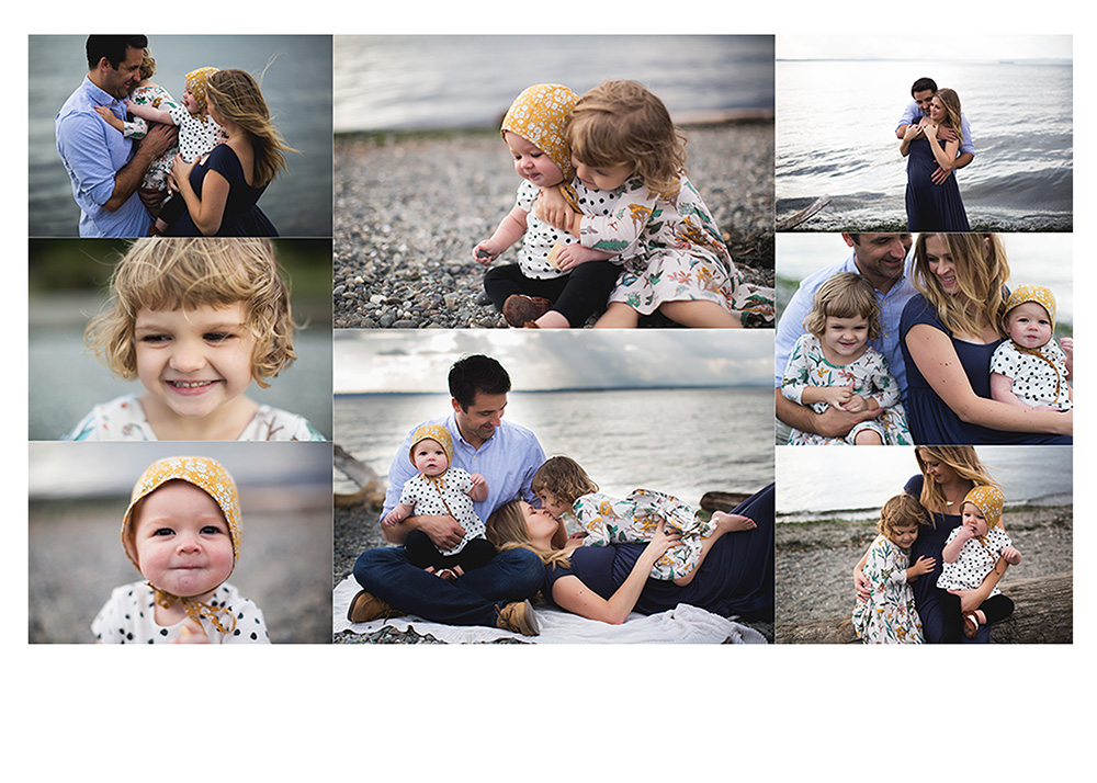
2. When designing your card, I personally believe less is more. I know you have many memories and photos you want to share, however I find it WAY more impactful and elegant when you choose just one photo for the front. When there are too many little photos on the card it is overwhelming to look at and not nearly as pleasing to the eye. I prefer to have one image on the front with the message and a little collage on the back. Here is an example (designed quickly by me, not by one of my recommended sites):
Front
Back:
3. Avoid cards that have images on diagonals or wonky angles. I think it is much more clean and modern to have your images straight with clean lines.
Yes:
NO
4. My last tip is don't be afraid to use an artistic shot for your card. No need to send out a traditional image. Be creative and choose an image with movement, laughter, or scenery. It will make your card unique and fun!
I can't wait to send out my cards! If you are making cards from a session with me, I would love to receive one. Cheers and Happy Holidays!


